Pages

Saturday, August 31, 2013

The Story of 10 Years

I know the challenge site CSI: Colours, Stories, Inspiration has been around for a long time and I've often checked them out, but until now I haven't played along. This month though I finally found the time since my DT commitments have reduced somewhat and I made a page for Challenge #86.


Here was the inspiration piece. The colours are totally 'me' aren't they? But what I love most is the focus they have on expressing yourself through journaling and they always include prompts for what to write about as part of the criteria. I'm still going through Jill Sprott's online class "Scrapbooking from the Soul" which is also all about concentrating on telling the story so it's all coming together for me right now.


The photo I picked to scrap was one taken on our 10th wedding anniversary while we were out for a romantic dinner. We actually went on a long-weekend away (sans kids!) and it was a really terrific time, although we missed them terribly of course!


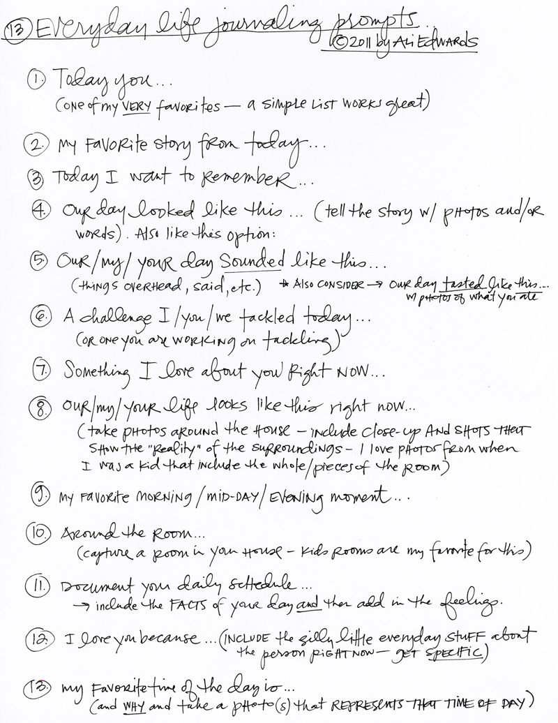
Taking my cue from the photo I then chose to journal some of the reasons why I love my husband. One of the criteria for the challenge was to pick a journaling prompt from this list by Ali Edwards (I picked #12). I'll definitely be keeping this for future reference - there's 12 other great prompts on there too!


When I'm faced with a colour challenge I tend to go through piles of my stash and pick out lots of bits and pieces that will coordinate. It often turns out that I throw a whole bunch of them on my page in random arrangement, and most of the time they're older products or things I've often overlooked before. It feels good to use up stash like this! But I had a whole 'eureka' moment when I saw that empty Sassafras alphabet sticker sheet in the right colour and realised I could use it to represent our initials! "M" and "N" all lined up down the bottom of the sheet.... it was perfect!!


And the little pink foam dots? They're the leftover pieces from a sheet of foam Thickers - they're all the extra dots for the top of i's but I'll never use them for that purpose and I've nearly finished the sheet otherwise, so I sprinkled 10 of them across the page to represent our 10 years together.

I'm already looking to the next CSI challenge to try and play along again!

Photobucket

Sunday, August 25, 2013

The Story of the Basics

I've learned something about my style recently. I actually realised for the first time that my favourite background paper is one that is white/cream/vanilla in colour with a subtle pattern such as grids, lines or distressing. The incident that brought this to my attention was when I finished off my pad of Basic Grey Basics Manilla collection. Do you remember it? Released about 3 years ago (or more?) it was the perfect collection of what I just mentioned.


I thought I would share with you some of the layouts I've made over the past years with the collection so you can see just what I mean. I'm sharing them here in reverse chronological order. You've seen this first layout here fairly recently, (and also over at the Paper Stories blog).


But now that it's gone I've got my sights on the Simple Surfaces collection that Cosmo Cricket just released at the last CHA. I think it's going to be perfect for me!


Photobucket

Thursday, August 22, 2013

The Story of Name Calling

I can honestly tell you I've been having such a fun time creating with the Hello Again collection from Carta Bella that's currently available in the Paper Stories store. I'm not sure that I had used Carta Bella before the lovely Georgia sent me this kit, and maybe you're in the same boat? Let me tell you the quality of these papers is fabulous! Do you remember the old Crate Paper, or the older My Mind's Eye papers that were thick and soft and velvety? That's what these are like.


For this first layout I've limited myself to only using the yellow, pink and black papers. When I'm faced with an entire collection I find it a little daunting to know where to start. For example, there's way too many fun tags and stickers to choose from! But if I make up a colour scheme to follow it helps me make choices about which ones to use.


I started my layout by cutting out a bunch of hearts into my background paper with my Silhouette. I backed it with a contrasting colour and made sure to stick some foam tape in between the layers to give it some depth and dimension. That's a little technique I've been playing around with lately and I'm really loving the results. I've made another page using this style but it's been picked up for publication by Scrapbook Trends (yep - shameless name dropping here!)


And of course, the cut-out hearts don't go to waste because I've used some here, and the rest ended up on my next layout! I've just doodled around them a bit with black and white pens.


Because most of the decoration on this page was done with the hearts I didn't need a lot more embellishments, but I've layered up some of the Element Stickers plus the Label and Flair from Ormolu which match perfectly. The title stickers also worked well as they continued on with the black & white theme. You can find these JBS stickers in the shop too (on sale!!)


This layout is all about the day my youngest finally called her sister by her proper name. You know how young kids tend to turn long difficult names into funny little abbreviations? Well it's taken my almost-4-year-old that long to be able to call her sister 'Bethany'. Mostly she calls her 'Bebesh'. It's partly our fault too of course, as we rarely call her Bethany either. She's got about a million little nicknames that we call her instead. It's just a family moment in our everyday lives that seems worth documenting :-)

Photobucket

Monday, August 19, 2013

The Story of Sunshine

Super jealous of you guys in the Northern Hemisphere as you enjoy the final days of summer. It's still very much the cold of winter here in Australia and I'm shivering my way through the mornings. I think I could probably do tropical all year round if given a choice. I think I'm by nature a sun-lover (very ironic given my once-red hair and freckled skin).


We recently enjoyed a family holiday in Queensland which was just spectacular. Sunshine, beaches, swimming, simply awesome! I agree with the catchphrase of Queensland who describes itself as "beautiful one day, perfect the next". It kinda makes a great title for a layout too don't you think?


I used my favourite JBS Modern Mercantile collection for this layout, but mixed in a generous amount of pink to coordinate with my girl's bathing suits. Those butterfly stickers are still ranked amongst my most used supplies. And the gold feather rubons? Perfection.


On a slightly related topic, have you seen the new class my fellow JBS designer Jill Sprott is leading at 2Peas? It's called "Scrapbooking from the Soul" and I'm part way through it. I have to say, it's one of the best classes I've ever taken. It really resonates with my way of thinking about scrapbooking, although I'm no where near her level of insightful journaling. I'm not associated with it in any way, this is not me trying to sell it. I just really think you should check it out if you want inspiration to take your journaling to a whole new level. It's really powerful.


That's all from me tonight.
Over and out.
xx

Photobucket

Supplies:


Saturday, August 17, 2013

The Story of Great Expectations

Did I just throw a whole bunch of supplies onto a page to create this page? Why, yes I did!

I have a lot of trouble actually 'killing' a kit because in my definition it does actually mean using up everything. Or at least using up all the large chunks of paper and making a big dent in every packet of embellishment and alphas that you received. I find it easy to make the first couple of pages where you're able to carefully pick and choose what will coordinate together, but when it comes to using up the last pieces it becomes a little more tricky for me.


Ultimately, I'm not 100% sure all these elements work well together on the one page. It feels a little bit like 'product vomit' but guess what? I sure killed that kit!! I'm not entirely unhappy with how it turned out, and I think every layout gives me a chance to learn something different. Here I learned that I like blue, white, yellow and kraft as a colour scheme, so I might try that again for some beachy photos in the future.


And even more importantly, I still scrapped an important story in our lives. Here I'm documenting some of my daughters personality traits and characteristics through a simple example. The story goes that she's been learning about what 'tempt' and 'temptation' means in her kids group at church. And when she's come home she wants to actually apply it to her life, so she's emptied out her bedroom of all books. You see, she finds one of her greatest 'temptations' is to read books when she's been put to bed and the lights are out.


The story says so much about my little girl. She's strong-willed and disciplined. She's willing to learn and grow and self-improve. And the fact that she thinks one of her biggest faults is her love of reading.... well I'll take that any day!!

Photobucket

Thursday, August 15, 2013

Sneaky sneak

Earlier in the week my first project share went live at Paper Stories. I would love for you to pop over and check it out! You can see it here on the PS Blog.


I'm working with the gorgeous Hello Again collection from Carta Bella and let me just tell you I am truly in love with these papers! The quality is top-notch and the colours are so rich and vibrant. The sneak above with the hearts is the first layout I'm sharing, whilst below you can see a sneak of my next one.


I did a little background work on this with Gelatos and Twinkling H2O's and over the weekend I'll pop up a video showing you my process. I can't wait!

Photobucket

Wednesday, August 14, 2013

The Story of Sugar & Spice

I thought I'd follow on from my last post sharing my layout of when my daughters met their new baby cousin, to this one of that same moment. This time the photo captures me meeting my new niece. She's super-cute isn't she?!


I took on the colour challenge in the last Scrapbooking Memories magazine for this page too. It was a little tricky as the colours to work with were black, white, cream and blush pink. It's almost a monochrome combination in a way, and I have never really excelled at monochrome layouts.


But I ended up really enjoying the process of this. What I did was to go through some of my older stash and pull out some packets of product that would work. I grabbed these Kaisercraft rubon birdcages for black, Doodlebug border strips and a Pebbles journal card for white.


The cream chipboard clouds and wood veneer frames are from Studio Calico, and the flower is Prima of course. Otherwise most of my pink came from the papers and a bit of paint. Then I went to town layering up little bits and pieces of all of them along with some scraps of paper and a good splash of mixed-media in the background.


I felt really satisfied with this layout for a few reasons. I'm always happy to have scrapped another important life-moment for a start, but it was especially awesome to work through a process that is initially quite challenging and find that you can still make something pleasing at the end of it. And I'm glad to have debulked my stash of old product somewhat too!

Photobucket

Sunday, August 11, 2013

The Story of Attempt #4

This is the last layout I've got to share in my series of 'failed' attempts whilst working on my application for Masters. This one was for the challenge of making an interesting and unique background. You can see 3 other attempts at this challenge here, here and here!


Whilst it never made the final cut for my Masters entry, I don't actually consider it a failed layout. I still like how it turned out, albeit quite different from my original idea. It involved a lot of fiddling and experimenting which is part of the fun and I loved playing with new techniques along the way.


I used some of my most favourite supplies - including reigniting my fondness of these JBS rubon butterflies. I've had this one in my stash for so long that unfortunately it got a little stuck on the packaging, but I'm never one to shy away from imperfections (!) so on it went anyway. I think it makes quite a bold statement on this page about my girls meeting their new baby cousin for the first time.


And sticking with the kraft and red colour scheme I chose these JBS feathers as my only other real embellishments. Given the nature of the challenge I didn't want to distract too much from all the background techniques that are supposed to be the focus of this layout.


First I made a Silhouette cut file with all this text of baby Zylee's name and date of birth. When I first cut it out I used it as a stencil and sprayed it with grey mist. The mist didn't really cut it for me so I lined up the stencil again and this time spread gesso through it. Much better! And you still get the faint outline of grey which is a bit cool. I stamped in between the words and splattered my usual paint and pearls. I ended up using the same cardstock letters from my original Silhouette cut for my title rather than mixing in another font. As I said, it all became a bit fiddly, but I kinda like it anyway :-)

Photobucket

Supplies:

LinkWithin

Related Posts with Thumbnails